
Your homepage should help a qualified buyer answer five questions in order: Is this for me? Which problem does it solve? What changes after I use it? Why should I believe you? What should I do next? Lead with the painful status quo and desired outcome. Introduce the mechanism after the reader recognizes the problem. Keep technical depth available for evaluation, but do not make it the entry fee for understanding the offer.
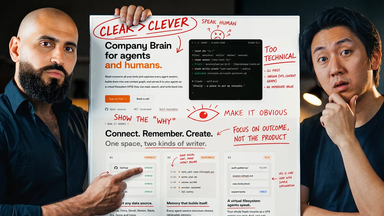
Leon Abboud found this gap while reviewing a venture-backed founder's website. He fit the company's ideal customer profile, yet could not explain what the product did. The issue was not the product. It was the sequence of the message.[1]
Why strong technical products produce weak homepages
A founder lives inside the product. You know the edge cases, architecture, roadmap, competitive constraints, and reasons each feature exists. A first-time buyer knows none of that.
This creates the curse of knowledge. The founder writes from the end of the learning curve while the buyer starts at zero. Every unfamiliar term asks the reader to do interpretation work before receiving value.
Nielsen Norman Group recommends that a homepage quickly communicate what the organization does and what users can accomplish there. Its homepage guidance also advises using the audience's language rather than jargon, business terminology, or feature-driven language.[2]
The fix is not to make the product sound simplistic. It is to make the first step simple.
Technical depth still matters. A serious buyer may need security details, integrations, deployment options, performance limits, or architecture. Put that evidence where it helps evaluation. Do not force it into the headline before the buyer knows why it matters.
Use the Buyer Translation Stack
A useful homepage moves through five layers. If a layer is missing, the reader has to build the bridge.
Start with the buyer's problem
A homepage is not the founder's autobiography. The buyer is the main character.
Leon's teardown shows how technical founders often place themselves or their invention in the hero position. The page celebrates what the team built, but the visitor cannot see their own problem in the story.[1]
Begin with the situation that sent the buyer looking for an answer.
Weak: "The intelligent orchestration layer for next-generation AI workloads."
Stronger: "Ship reliable AI features without debugging every model change in production."
The second version gives a specific buyer a recognizable problem and outcome. It earns the right to explain orchestration later.
Use phrases from sales calls, onboarding sessions, support tickets, and product reviews. The sales call content workflow shows how to capture this language without exposing private details.
Name the outcome
Once the visitor recognizes the problem, show the change your product helps create.
The outcome should be concrete enough to picture but restrained enough to support. "Never worry about compliance again" creates more skepticism than confidence. "Collect audit evidence in one reviewable workspace" tells the buyer what changes.
A useful outcome combines the job the buyer wants done, the friction removed, and the context where the result matters. For example: "Reconcile onchain treasury activity without rebuilding the month in spreadsheets."
This speaks to a Web3 finance buyer's job and pain. It leaves room below the fold to explain data sources, wallets, controls, and reporting logic.
Introduce the mechanism
The mechanism is the bridge between the promise and the technical detail. It should be specific enough to make the outcome credible, but simple enough for a buyer to repeat to a colleague.
[Product category] that [key action] so [buyer] can [outcome].
Example: An evaluation workspace that catches model regressions before your AI release reaches customers.
Then expand with three short steps: connect the source the buyer already uses, run the important workflow, and review or act on the result.
Leon calls technical detail introduced too early a messaging error. His sequence is problem first, then the clever material.[1] That order respects both audiences: the economic buyer can understand the value, while the technical evaluator can inspect the substance.
Write a first screen that passes the Grunt Test
Leon uses the Grunt Test as a practical clarity check. A person should be able to glance at the page and understand what you offer, why it matters, and what to do next.[1]
Your first screen needs four elements:
- A headline that names the useful change.
- A short supporting sentence that identifies the buyer, problem, or mechanism.
- One primary call to action.
- A relevant visual or proof cue that makes the product easier to understand.
The headline does not need to contain the entire pitch. It needs to create orientation.
Nielsen Norman Group describes clear information scent as the cues people use to judge whether a page is likely to answer their question and how much work that answer will require.[4] A vague headline, a generic image, and a "Learn more" button provide weak cues. Specific language tells the right visitor that they are in the right place.
Headline: Achieve [desired outcome] without [costly friction].
Supporting line: [Product] helps [specific buyer] [complete important job] by [plain-language mechanism].
Primary action: Use the next step the buyer expects, such as "See the product," "Run a sample evaluation," or "Book a technical review."
Proof cue: Show the interface, a verified customer statement, a concrete workflow, or a compatibility signal.
Do not treat this as a fill-in-the-blank law. Use it to force clarity, then rewrite until it sounds like your market.
Build the rest of the homepage around buyer questions
What is going wrong now?
Describe the cost of the current approach. Use the buyer's world, not a manufactured crisis. Show the operational consequence: delayed releases, manual reconciliation, invisible pipeline risk, fragmented evidence, or repeated work.
How does this work?
Show a small process. Three steps are often enough to give the reader a mental model. Link to deeper product or technical documentation when the decision requires it.
Is this built for my situation?
Name the most important use cases, environments, or roles. Avoid claiming the product is for everyone. A narrow, accurate fit statement helps the right person self-select.
Why should I trust it?
Use proof that matches the claim. A security claim needs security evidence. A workflow claim needs a product demonstration or clear example. An outcome claim needs a verified result with context.
Logos without explanation are weak proof. If permission and evidence exist, tell the buyer what was used, by whom, and for what job. If you do not have customer evidence yet, use a transparent product walkthrough, founder expertise, technical documentation, or design-partner process rather than inventing authority.
What should I do next?
Choose one primary action that reflects the sale. A self-serve product can offer a trial or working example. A complex enterprise product may need a technical consultation or tailored demonstration. A new category may need an educational guide before a call.
The personal brand monetization guide explains how to match the next step to the reader's current level of trust. The homepage is one part of that commercial path, not an isolated brochure.
Make technical copy scannable without removing substance
People scan before they commit to reading. Nielsen Norman Group's web-writing research found that concise, scannable, and objective presentation improved measured usability compared with promotional writing in its study.[3]
- Give each section one job.
- Start paragraphs with the useful point.
- Replace category jargon with the words buyers use.
- Turn feature lists into problem, capability, and outcome groups.
- Use descriptive headings that make sense when read alone.
- Keep proof next to the claim it supports.
- Link to technical depth instead of hiding it or dumping it all on the homepage.
Scannable does not mean shallow. It means the page exposes its structure so different members of a buying group can find what matters to them.
A rewrite method for technical founders
1. Record the current message
Copy the headline, supporting line, calls to action, and section headings into a document. Do not defend them yet.
2. Run five buyer interviews
Ask recent prospects or customers what was happening when they started looking, how they described the problem internally, which alternatives they considered, what was difficult to understand, and which proof helped them trust the decision.
If interviews are not available, review recent sales calls and support conversations. Do not rely only on internal language.
3. Build the Buyer Translation Stack
Write one sentence for each layer: problem, outcome, mechanism, proof, and action. Remove any term a qualified buyer would not use or understand on first contact.
4. Draft three first screens
Create three different headline and supporting-line pairs. Keep the product and evidence constant. Vary the framing around the strongest buyer problem or outcome.
5. Test comprehension before conversion
Show the first screen to someone who fits the market but has not heard the pitch. Give them a few seconds, then ask what the company helps with, who it is for, why someone might choose it, and what they would click next.
If they cannot answer, the page has a comprehension problem. A conversion experiment will not fix a message nobody understands.
6. Add proof and technical depth
Once the core message is clear, add the evidence serious evaluators need. Keep each proof item close to the corresponding claim. Make security, architecture, integrations, and documentation easy to find.
7. Measure the handoff
Track meaningful actions, not only pageviews. Depending on the business, these may include product starts, qualified demo requests, technical-documentation visits, completed assessments, and sales conversations.
Ask new opportunities what they understood from the page and what remained unclear. The best homepage copy is not finished in a workshop. It improves through buyer evidence.
Common mistakes to remove
Category poetry
Phrases such as "the future of intelligent infrastructure" sound ambitious but do not tell the buyer what to do with the product.
Feature piles
A row of technical features can prove depth after the buyer understands the job. Before that, it looks like homework.
Founder as hero
The founder can be visible, but the story should help the buyer succeed. Your expertise makes you the guide.
Technical detail too early
Lead with the problem and outcome. Reveal depth as the buyer's questions become more specific.
Multiple primary actions
"Start free," "Book demo," "Join Discord," "Read docs," and "Contact sales" cannot all be primary. Choose the action that best fits the intended visitor.
Unsupported superlatives
"Best," "revolutionary," and "world-class" create claims the reader cannot evaluate. Replace them with a mechanism, constraint, demonstration, or verified proof.
A homepage copy checklist
- A qualified buyer can identify the offer in a few seconds.
- The headline names a meaningful outcome or problem.
- The supporting line identifies the buyer or context.
- The mechanism is repeatable in plain language.
- Technical terms appear only where they improve evaluation.
- Every material claim has suitable evidence.
- Headings make the page easy to scan.
- The primary action is obvious and proportionate to trust.
- The page works on a phone without hiding critical context.
- Sales can repeat the same message without translating it again.
A technical product does not need less substance. It needs a better sequence. Start where the buyer starts, guide them through the problem and outcome, then reveal the mechanism and depth that make the product credible.
The founder-led marketing guide shows how to connect this clear message to the rest of your content system. The customer acquisition guide explains how relevance and trust can outperform broad attention.
If your product is strong but buyers still struggle to understand why it matters, book a Founder Funnel strategy call. We install the content infrastructure that turns founder knowledge into clear market visibility, trust, and qualified pipeline.
Sources
- Leon Abboud, "Helping this founder build a $ million landing page", published 17 August 2026.
- Nielsen Norman Group, "Homepage Design: 5 Fundamental Principles", published 15 March 2024.
- Nielsen Norman Group, "Concise, Scannable, and Objective: How to Write for the Web".
- Nielsen Norman Group, "Information Scent: How Users Decide Where to Go Next".